


Table of contents
- 1. Borders: Adding Style and Structure
- 2. Dimensions: Width and Height on Block Elements
- 3. The CSS Box Model: Content, Padding, Border, and Margin
- 4. Padding: Adding Space Inside Elements
- 5. Margin: Adding Space Outside Elements and Collapsing
- 6. The Universal Selector: Resetting Margin and Padding
- 7. Height and Width: Why They Don't Apply to Span Elements
- Questions
Today, I learned about some essential CSS concepts, including borders, dimensions, the box model, padding, margin, universal selectors, and more. These concepts are fundamental to creating visually appealing and functional web designs. In this blog post, I'll explain each of these concepts in an easy-to-understand way, with real-world examples and code snippets to help you apply them to your projects. Whether you're a beginner or an experienced web developer, this post will provide you with valuable insights into mastering CSS. So, let's dive in!
1. Borders: Adding Style and Structure
Borders are a fantastic way to add style and structure to your HTML elements. The border property in CSS is a shorthand for setting the border-width, border-style, and border-color properties. Here's an example:
/* width | style | color */
div {
  border: 2px solid #f33;
}
Some commonly used border styles are solid, dotted, dashed, double, groove, ridge, inset, and outset. You can also set individual border properties like border-top, border-right, border-bottom, and border-left.
Border Width
The border-width property sets the width of the border. You can use the shorthand property and the clock rule (top, right, bottom, left):
/* top | right | bottom | left */
border-width: 1px 2px 3px 4px;
Border Style
The border-style property sets the style of the border. You can use the shorthand property and the clock rule (top, right, bottom, left):
/* top | right | bottom | left */
border-style: solid dotted dashed double;
Border Color
The border-color property sets the color of the border. You can use the shorthand property and the clock rule (top, right, bottom, left):
/* top | right | bottom | left */
border-color: red green blue yellow;
Real-World Example
Imagine you're creating a website for a bakery, and you want to showcase different types of pastries in a grid layout. You can use borders to separate each pastry item and make them stand out:
.pastry-item {
  border: 3px solid #f33;
  border-radius: 5px;
  padding: 10px;
  margin: 10px;
}
2. Dimensions: Width and Height on Block Elements
Width and height properties are used to set the dimensions of block elements. For example:
div {
  width: 300px;
  height: 200px;
}
This sets the width of the div to 300 pixels and the height to 200 pixels. You can also use percentage values to make the dimensions responsive to the parent container:
div {
  width: 50%;
  height: 50%;
}
Real-World Example
Suppose you're designing a blog layout, and you want to create a fixed-width sidebar for navigation. You can use the width and height properties to set the dimensions of the sidebar:
.sidebar {
  width: 300px;
  height: 100%;
  position: fixed;
  left: 0;
  top: 0;
}
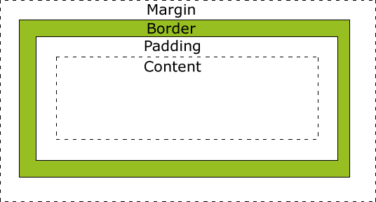
3. The CSS Box Model: Content, Padding, Border, and Margin
The CSS box model is the foundation of layout design in CSS. It consists of four parts: content, padding, border, and margin. The content is the actual text or images inside an element, padding is the space between the content and the border, the border surrounds the padding and content, and the margin is the space outside the border.
Real-World Example
Consider a news website with articles and a featured image. You can use the CSS box model to style the article layout:
.article {
  padding: 20px;
  border: 1px solid #ccc;
  margin: 20px;
}
.featured-image {
  margin-bottom: 20px;
}
4. Padding: Adding Space Inside Elements
Padding is the space between the content and the border. You can set padding using the shorthand property, which follows the clock rule (top, right, bottom, left):
/* top | right | bottom | left */
padding: 10px 20px 10px 20px;
You can also set vertical and horizontal padding separately:
/* vertical | horizontal */
padding: 10px 20px;
Real-World Example
Imagine you're creating a pricing table for a subscription-based service. You can use padding to add space between the content and the border, making the table more readable:
.pricing-table {
  padding: 20px;
  border: 1px solid #ccc;
  margin: 10px;
}
5. Margin: Adding Space Outside Elements and Collapsing
Margin is the space outside the border. Like padding, you can use the shorthand property and the clock rule:
/* top | right | bottom | left */
margin: 10px 20px 10px 20px;
Margin collapsing occurs when two vertical margins come into contact, and the larger margin absorbs the smaller one. This can happen between sibling elements or between a parent and its child element.
Real-World Example
Suppose you're designing a portfolio website with a grid of project thumbnails. You can use margins to create space between the thumbnails:
.project-thumbnail {
  margin: 10px;
}
However, if you have a heading element inside the thumbnail, you might experience margin collapsing. To prevent this, you can use the overflow property:
.project-thumbnail {
  overflow: auto;
}
6. The Universal Selector: Resetting Margin and Padding
The universal selector (*) targets all elements on a page. It's common to set the margin and padding of the entire document to zero to remove browser default styles:
* {
  margin: 0;
  padding: 0;
}
Real-World Example
When building a website from scratch, you might want to start with a clean slate by removing default browser styles. Using the universal selector to reset the margin and padding can help you achieve a consistent look across different browsers:
* {
  margin: 0;
  padding: 0;
  box-sizing: border-box;
}
7. Height and Width: Why They Don't Apply to Span Elements
span is an inline element, and inline elements don't have dimensions like block elements. Width and height properties don't apply to inline elements because they flow with the text and don't create a new block-level context. To apply width and height to a span, you can change its display property to inline-block or block.
span {
  display: inline-block;
  width: 100px;
  height: 50px;
}
Real-World Example
Imagine you're creating a tag cloud for a blog, and you want to style each tag with a specific width and height. You can change the display property of the span elements to inline-block and set the dimensions:
.tag {
  display: inline-block;
  width: 80px;
  height: 30px;
  line-height: 30px;
  text-align: center;
  border: 1px solid #ccc;
  border-radius: 5px;
  margin: 5px;
}
Questions
What are some commonly used border styles in CSS?
How do you set the dimensions of a block element using width and height properties?
What is the CSS box model, and what are its four parts?
How do you set padding using the shorthand property and the clock rule?
What is margin collapsing, and when does it occur?
How do you use the universal selector to remove default browser styles?
Why don't width and height properties apply to span elements, and how can you make them applicable?